Properly Size Images for the Web
Even weather.com is doing this wrong - are you?
I usually check the weather on my phone, but last week I visited weather.com on my laptop. Here’s what I saw:
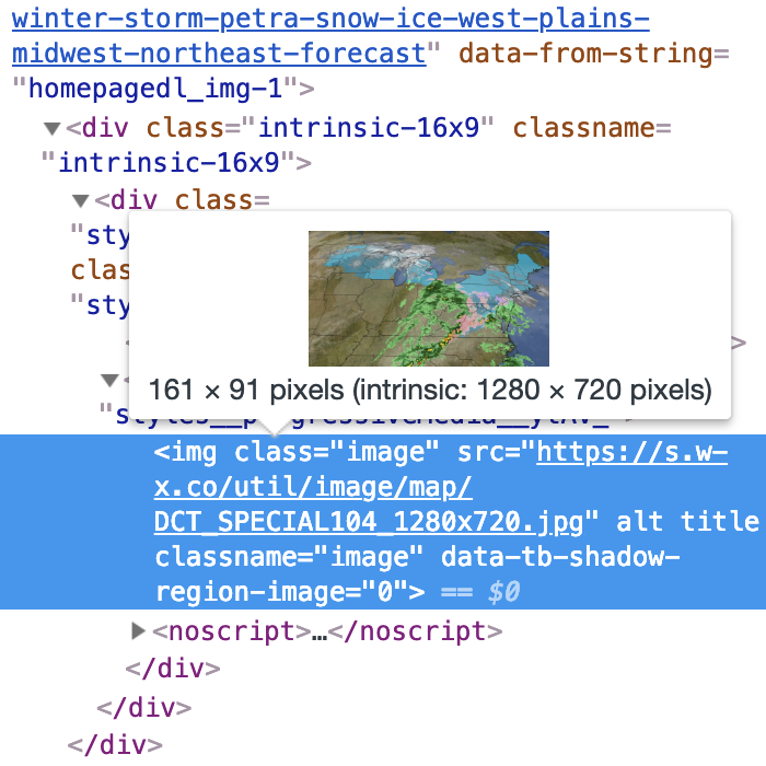
Why is the image in the top right so much slower to load than the others around it? I opened up Chrome Devtools to check it out:

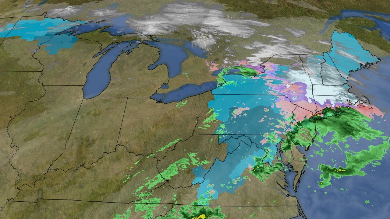
“intrinsic: 1280 x 720 pixels”. That means the source image was 1280 x 720 despite the actual displayed <img> element being much smaller! The largest that <img> element grows to on weather.com is 232 x 130, but your browser still has to download the entire 1280 x 720 image to display it. This unnecessarily slows down the site and wastes bandwidth.
Here’s a side-by-side comparison of the original image and a smaller version of it:


Can you tell the difference between them without zooming in? I can’t. The original image is 213 kB, but the resized one is only 66 kB. That’s a savings of 147 kB, or 69%! The resized image is over 3x smaller. This is especially impactful given the image’s prominent location on the weather.com homepage - it should load fast.
Note: I resize to 464 x 260 instead of 232 x 130 to support Retina displays.
Here’s another instance of the same issue on weather.com:
The original image is 2600 x 1733, but it’s used as the background-image: for a <div> that’s much smaller:

Only 595 x 350 (or 1190 x 700 on Retina displays) of the original image is visible, so the rest can just be cropped out. Even on a Retina display, 82% of the original image goes unused.
Example Weather Channel Popup
Please turn off your ad blocker so our site can load even slower than it already does. Thank you for suffering through our poor page performance.
Example Weather Channel Popup
Please turn off your ad blocker so our site can load even slower than it already does. Thank you for suffering through our poor page performance.
The original image is 779 kB, but the cropped one is only 173 kB. That’s a savings of 606 kB, or 78%! The cropped image is 4.5x smaller.
@weatherchannel make sure to properly size images on https://t.co/lhrWBk1DCZ so the site loads faster! https://t.co/VFqgPwEZYp
— Victor Zhou (@victorczhou) February 22, 2019
People that don't size images properly on production sites:
— CSS-Tricks (@css) February 28, 2019
1) Beginners
2) Massive corporate teams with super high traffic sites
3) Literally everybody omghttps://t.co/9v0SOK0rI7 pic.twitter.com/EUYHMmVaZ3
The lesson: serve images at the size they’re actually rendered at. Images that are too large look the same but slow down page loads and waste bandwidth.
Want to learn more? Read Google’s recommendations on properly sizing images.


